A Public Service Announcement
Simple elegance. It’s a term that’s basically synonymous with Japanese art and culture. Consider the simple beauty of the haiku, the refined approach to cuisine, and the natural harmony found in their interior design.
The Japanese are also known as people of few words, preferring simplicity and inference when conveying thoughts and ideas. A single, well-calligraphed kanji character can pack an amazing amount of meaning into a single rectangular space.
Well, that all gets thrown out the shoji window when it comes to PowerPoint. Millennia of culture instantly becomes moot, as Japanese professionals use the alluring appeal of a blank white rectangle to spew out as many words as they possibly can.
The fact is that the Japanese are the world’s biggest abusers of PowerPoint. They are behind some of the greatest atrocities ever committed in the modern business world, and I’m here to present the evidence, in hopes to both enlighten as well as ignite change.
Where Zen Goes To Die
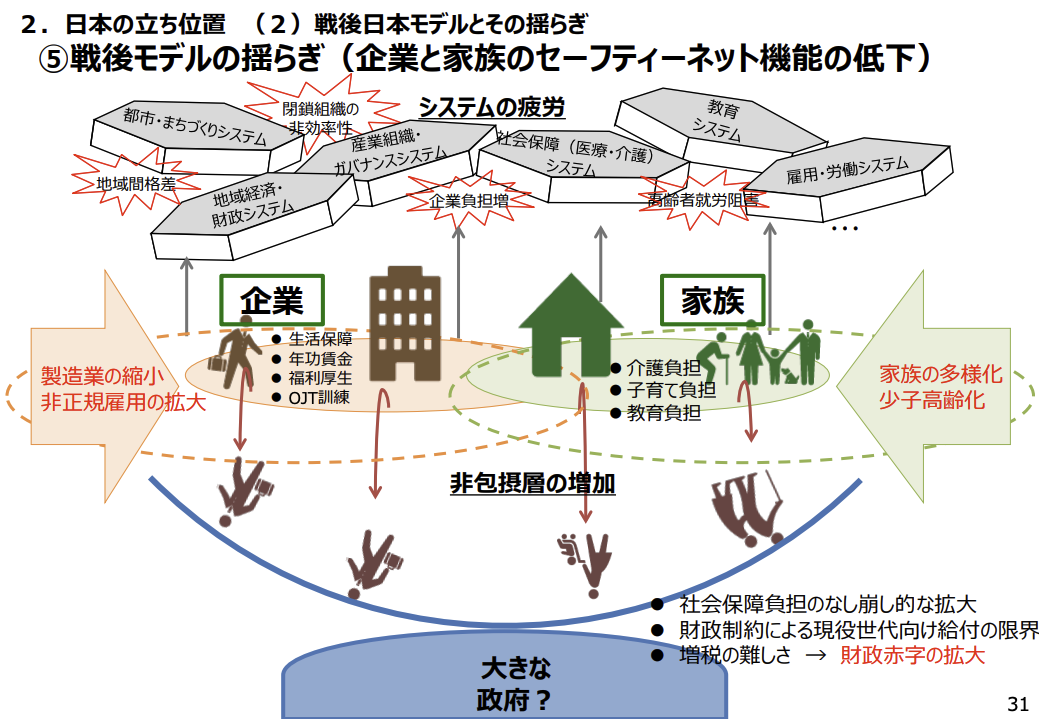
Behold Exhibit A, a slide that talks about remote work in Japan. Yes, it’s from the government, and they are the worst instigators of this problem, but you see it in all industries here.
Red text is used for emphasis, and you can see here that it’s really working out well for them, especially in tandem with the red speech bubbles coming out of the various green rectangles. These rectangles contain topics that should really be headers of content, but then that would ruin the stained glass look they were going for in the middle.
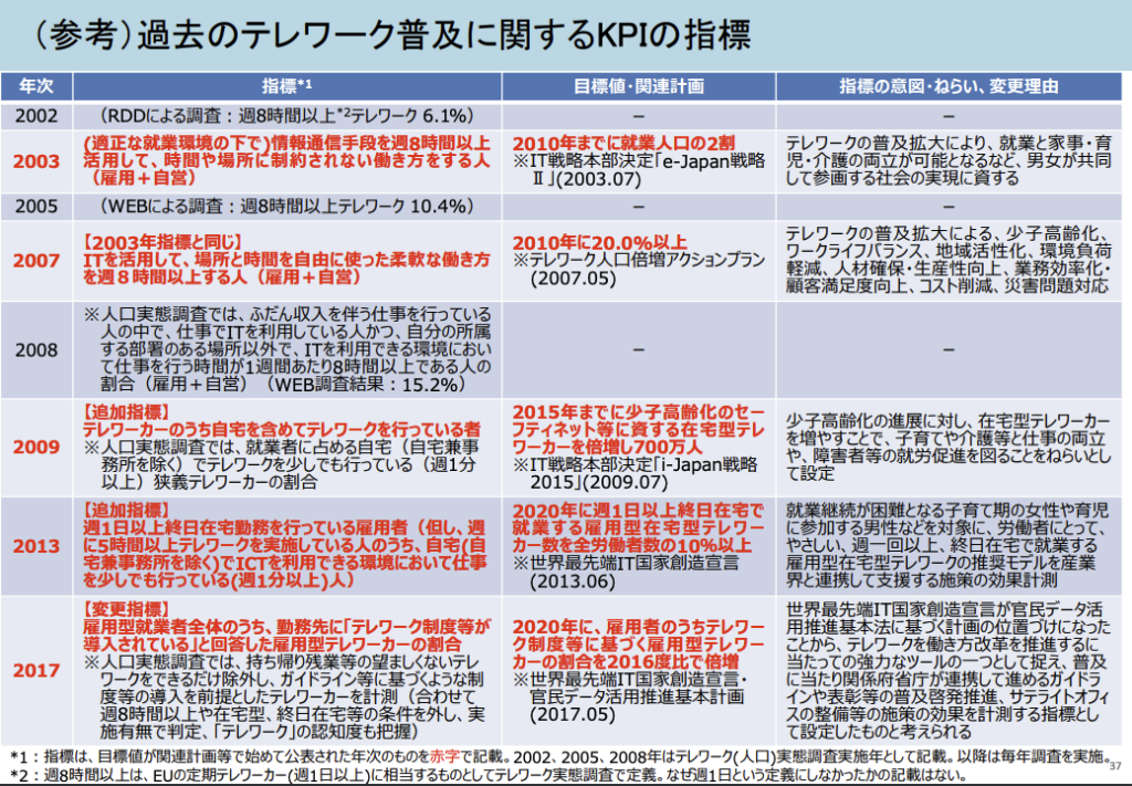
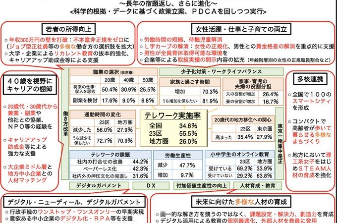
Exhibit B is another case where red text saves the day, and makes everything more clear and concise, as you can plainly see. Everything is laid out in a manner where you just want to do the opposite of reading it. I am not a fan of when only certain parts of sentences are highlighted. It means you used too many words, yo.
By the way, if you’ve ever had a gig where you have to translate something like this into English, you probably have some empty Maalox bottles on your desk. English ends up being almost twice the size of the original Japanese, and if the client still wants it all on one page, it becomes an adventure in using as many acronyms and abbreviations as possible. The weebs don’t think about this when they fantasize about living and working in Japan.
Exhibit C shows that not even cute pictures can save things. The people in the upper left are toasting how they were able to fit 5,000 characters into a single slide. Everything is Brady Bunched into a grid, ostensibly to clearly delineate the content, but I challenge you to make sense of any of this. I certainly can’t, and I can even read it.
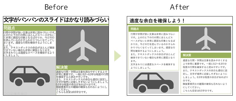
The fun thing is that there are sites that profess to teach people how to improve their PowerPoint slides. Exhibit D is below, showing how just some small tweaks to margins can radically improve the sleep-inducing power of your slides.
There are a ton more examples that I could provide, but a lot of them are from my clients, and are not meant for public consumption. Trust me when I say I’m doing you a service here.
Change We Must

I don’t know what it is about PowerPoint that makes Japanese people let go of their restraint and hose each slide down with words. But this is a real problem, one that is eating away at what used to be a less-is-more culture.
I honestly don’t know what to do about it. I tell my Japanese staff that they need to go easy on the verbiage, and they nod in understanding, but then turn in the MS Office version of the Rosetta Stone.
What we need is a hero, someone to swoop in and save Japanese businesspeople from themselves. Since Steve Jobs is gone, I nominate Marie Kondo. If she can tidy up houses the way she does, surely she can help clean up PowerPoint presentations. I just know she could spark joy with the delete key.


The same goes for Japanese websites, which often contain nothing more than these ugly, unreadable PowerPoint slides.
So true. Also, not so much anymore, but they used to be really big into putting lots of little banners on pages. I called it the NASCAR style of web design.
But then how would you deliver the presentation if you don’t put the whole script on the slides and then read them?
Haha, so true. Every meeting and presentation is a read along thing, sadly.